
PAPER GUIDE
Colorplan Paper: Colours, Weights and Print Finishes
Colorplan is a broad family of coloured, uncoated papers designed for work in which the material itself carries much of the visual identity. Its palette, weights and surface options make it useful for everything from stationery to substantial multi-layer cards.
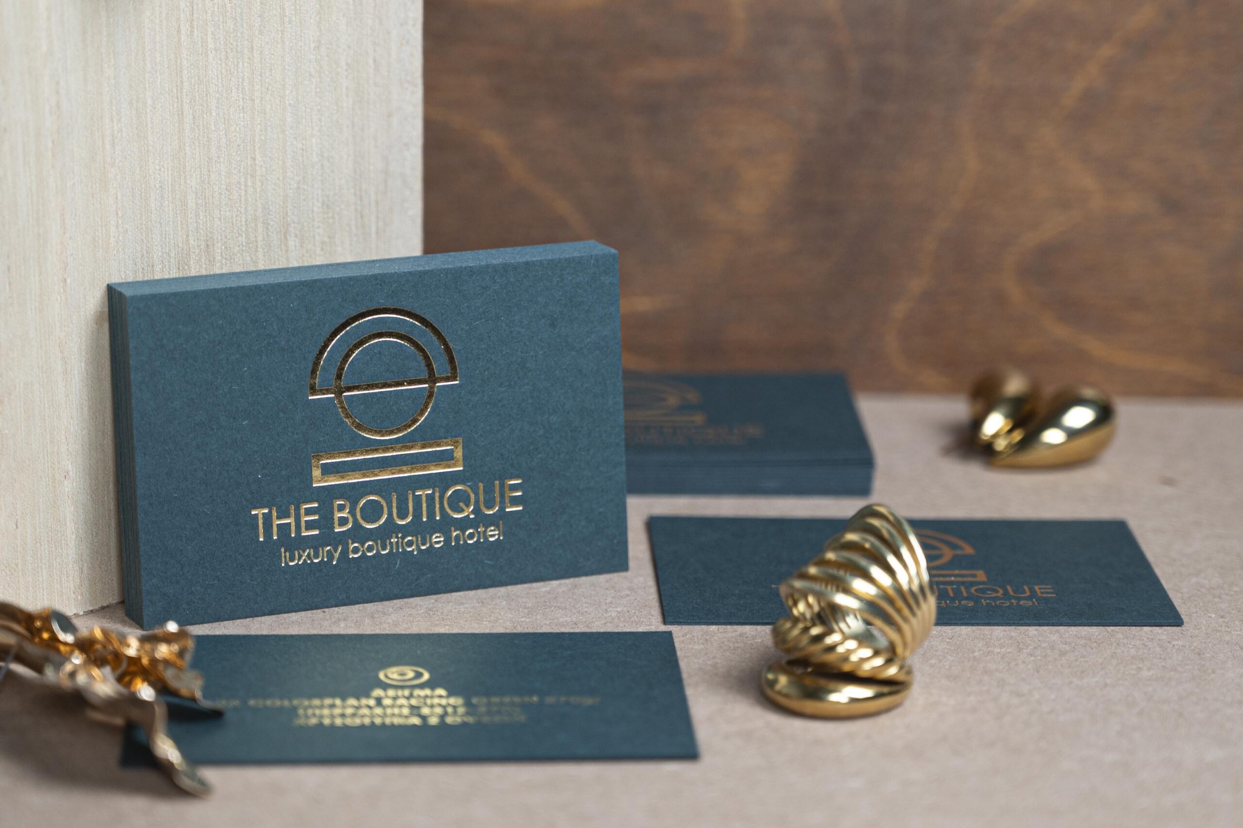
CURRENT RANGE
50 colours in the current G. F Smith shop range
WEIGHTS
Eight listed weights, with availability varying by colour
SURFACES
A smooth standard face plus a broad embossing programme
MATERIAL CHARACTER
Colour runs through the paper—not over it.
Colorplan is pulp-coloured, so the selected shade remains visible at a clean cut edge. That is different from printing a colour over white paper: the paper is the colour base, not simply a carrier for ink.
The standard surface is uncoated and relatively controlled. Optional embossings can introduce a more pronounced texture, but they also change how fine ink, foil and impression detail sits on the sheet. Always specify colour, weight and surface together.
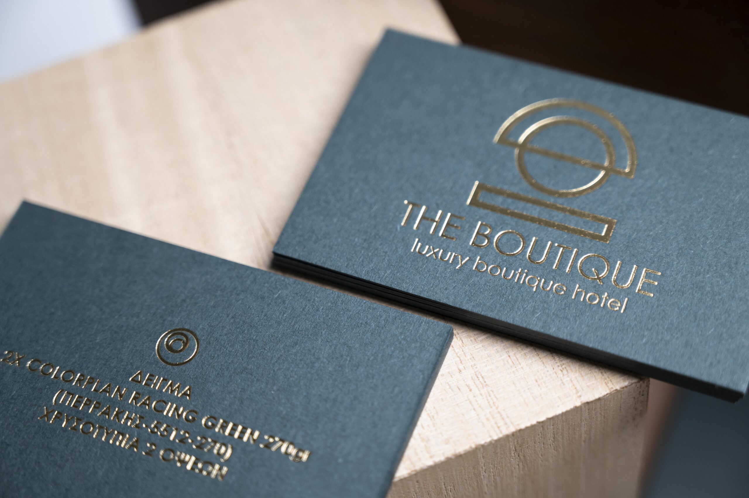
WHAT IT SUPPORTS
A flexible base for quiet or highly finished work.
Colorplan is valuable because the same colour system can move between thin stationery, a single substantial sheet and bonded constructions.
01
Hot foil
Opaque foil can create reliable contrast over deep paper colours while preserving the uncoated surface around it.
02
Letterpress and blind impression
The paper can take pressed detail, but line weight, impression depth and the chosen embossing must be reviewed together.
03
Duplex and Triplex work
Bonding the same shade or contrasting shades creates thickness and makes the paper colour visible through the edge.
04
Printing
Spot-colour and selected digital or offset routes are possible; ink behaviour and show-through depend on shade, surface and weight.
SPECIFYING THE RANGE
Choose in the order: colour, weight, surface, process.
Start with a physical swatch whenever colour is central to the identity. Screen previews cannot show the exact hue, surface or change under warm and cool light.
After colour, confirm the required weight and surface. Not every colour is stocked in every weight, and an embossed face can require a different artwork approach from the standard surface.
CONSIDER BEFORE CHOOSING
- Use a physical swatch for colour-critical work.
- Check that the chosen shade exists in the required weight.
- Allow more generous detail on strongly embossed surfaces.
- Test foil or ink when contrast is deliberately subtle.
ARTWORK APPROACH
Let the paper do part of the design work.
Deep Colorplan shades often work best with restrained typography and one confident process rather than dense surface coverage.
Prepare hot foil, letterpress and blind-impression artwork as separate vector layers. A coloured-paper proof should be used when ink colour or fine reversed detail is important.
Range details checked against G. F Smith’s current Colorplan range. Confirm current local stock before production.
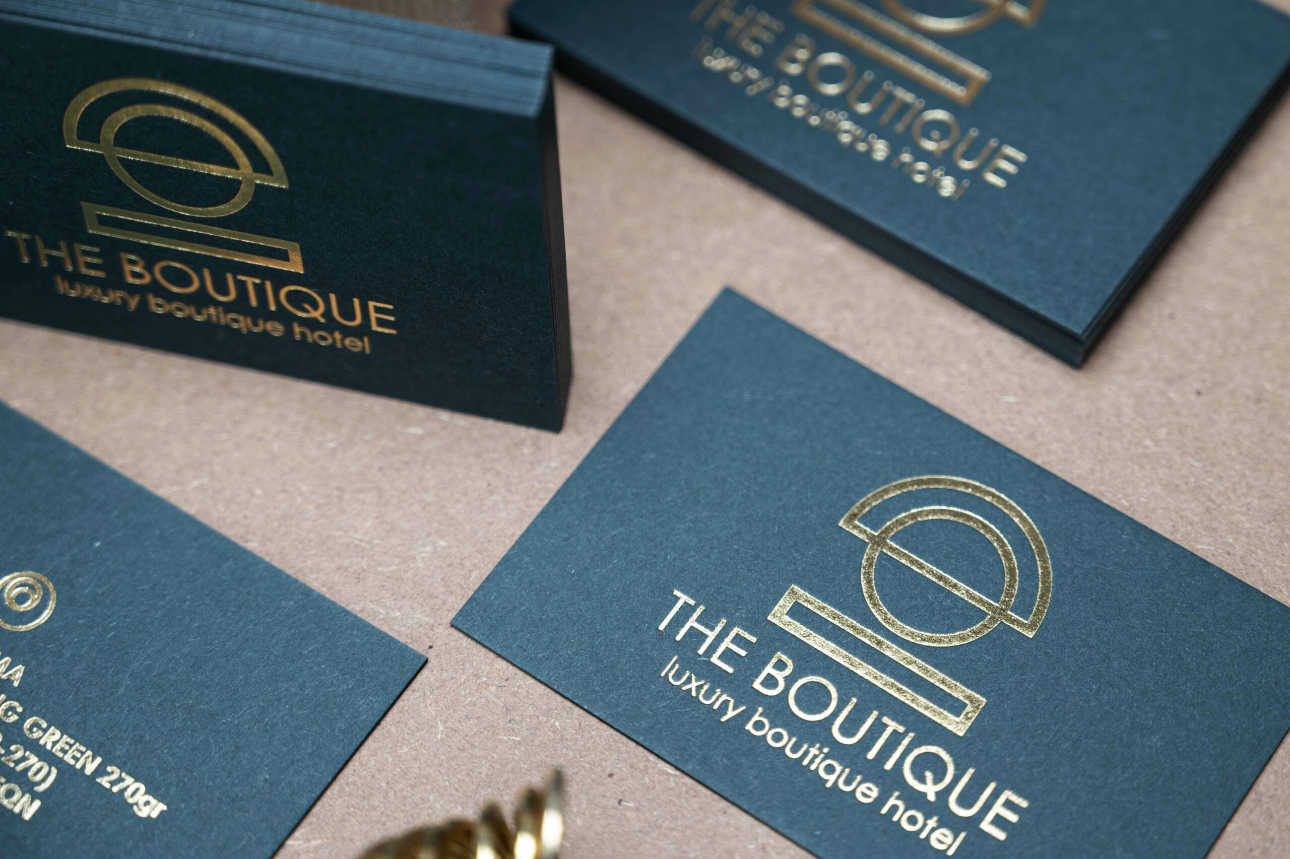
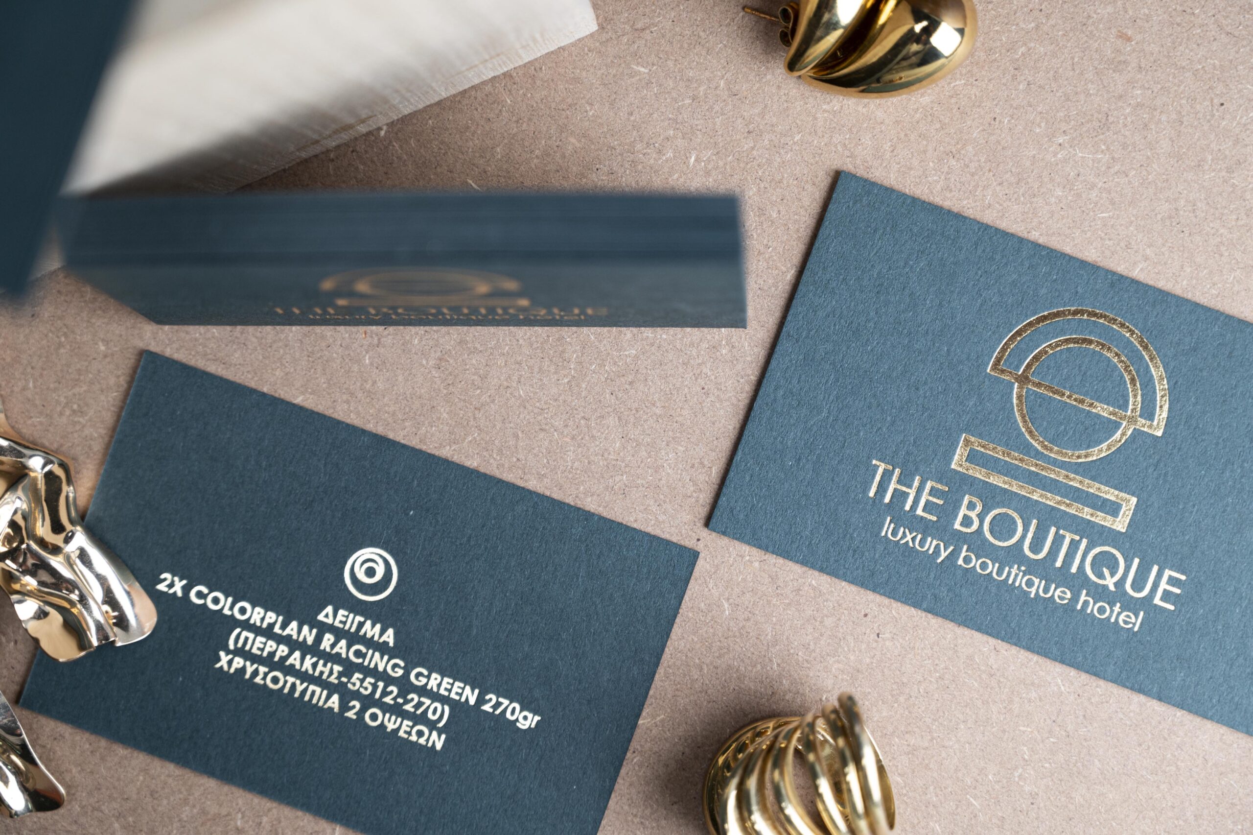
FROM MATERIAL TO CARD
Choose the paper, then build the process around it.
Tell us the paper family, colour, quantity, finished size and the effect the card needs to create. We can confirm availability and the appropriate production route before artwork approval.