
PAPER GUIDE
Keaykolour Paper: Colour, Texture and Print Possibilities
Keaykolour is a premium coloured uncoated paper with a natural feel, useful bulk and a coordinated palette. It is particularly relevant when a design needs the paper colour to remain visible and the surface to respond to foil or pressure.
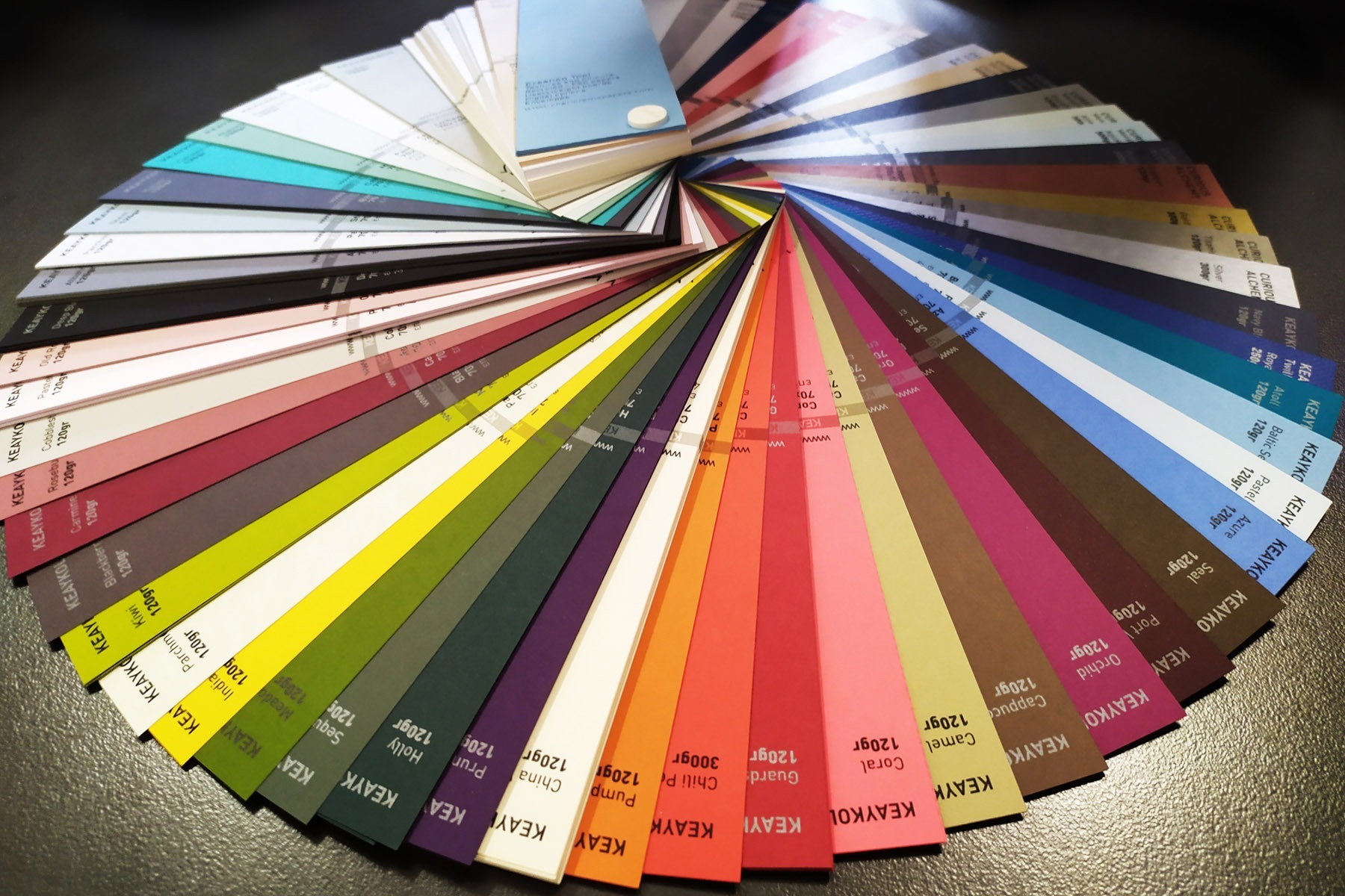
CURRENT PALETTE
45 colours arranged across nine colour families
WEIGHT RANGE
Published from 120 to 450 gsm
SURFACE
Natural-feeling, uncoated paper with a lightly rough face
MATERIAL CHARACTER
A coloured paper with noticeable body and grain.
Keaykolour combines a mass-coloured sheet with a tactile, lightly rough surface. Its stiffness and bulk make it useful where a single sheet must feel deliberate, or where two or three sheets are joined into a more substantial object.
The main palette moves from whites and pastels through brighter, mid-tone and deep colours. Separate embossed grades add stronger patterns, so “Keaykolour” alone is not a complete paper specification: colour, weight and surface still need to be named.
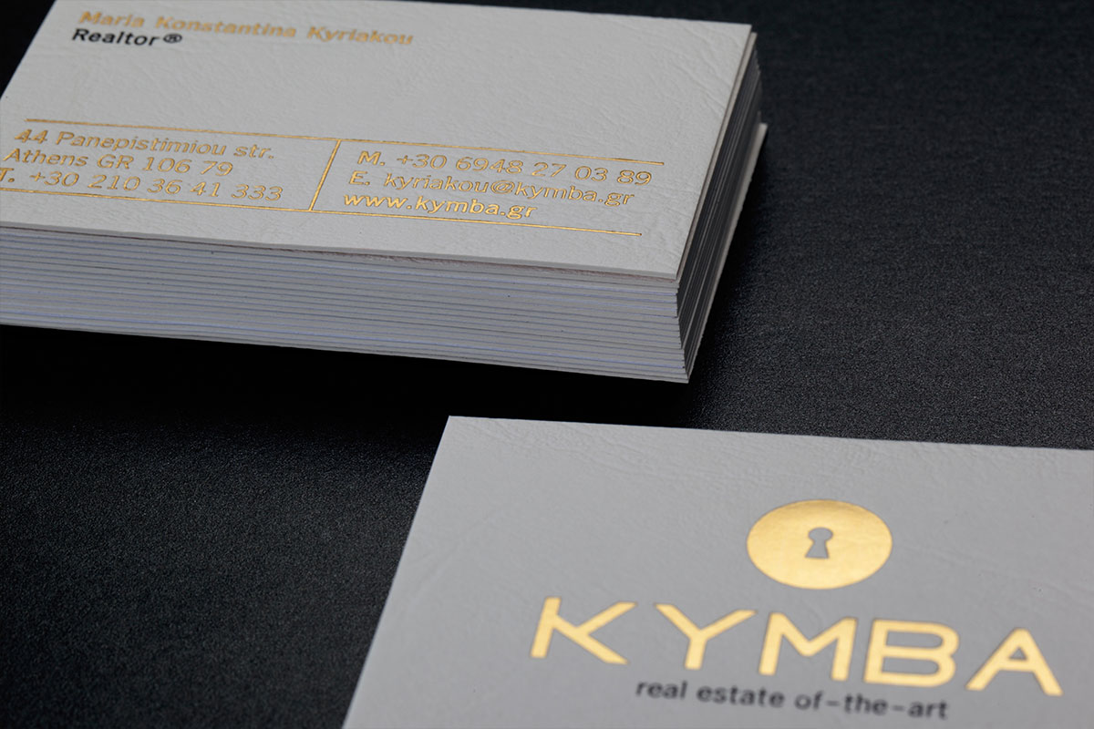
WHAT IT SUPPORTS
Pressure and reflection work well against its natural surface.
Keaykolour is commonly chosen when the paper should remain visibly uncoated while the finishing process introduces controlled contrast.
01
Hot foil
The smooth metallic or pigmented foil surface contrasts with the paper grain and can stay opaque over strong colours.
02
Letterpress
The paper’s body supports a visible impression, subject to weight, detail and the selected surface.
03
Embossing and debossing
Relief can be effective, but the reverse-side displacement and interaction with other artwork must be planned.
04
Layered cards
Different Keaykolour colours—or Keaykolour combined with another paper—can create a deliberate edge and reveal.
CHOOSING A SHADE
Treat colour as a material decision, not a screen value.
The same colour appears different beside another sheet, under warm light and beneath reflective foil. Use a physical swatch and consider the surrounding brand colours before locking the paper.
For fine printing, decide whether the paper should remain the dominant colour or whether ink must carry detailed information. Deep colours may require opaque processes rather than conventional transparent ink.
CONSIDER BEFORE CHOOSING
- Confirm the exact colour, weight and surface.
- Check foil or ink contrast on deep shades.
- Keep fine reversed type away from strongly textured grades.
- Plan front and back artwork around any deep impression.
ARTWORK APPROACH
Separate every physical process clearly.
Supply foil, letterpress and embossing as distinct vector masks. If a Pantone ink is used, name the colour and keep it separate from process artwork.
For layered constructions, include a simple layer map showing which paper sits on each face and where cut-outs or reveals expose the sheet beneath.
Range details checked against Antalis’s current Keaykolour overview. Confirm current local stock before production.
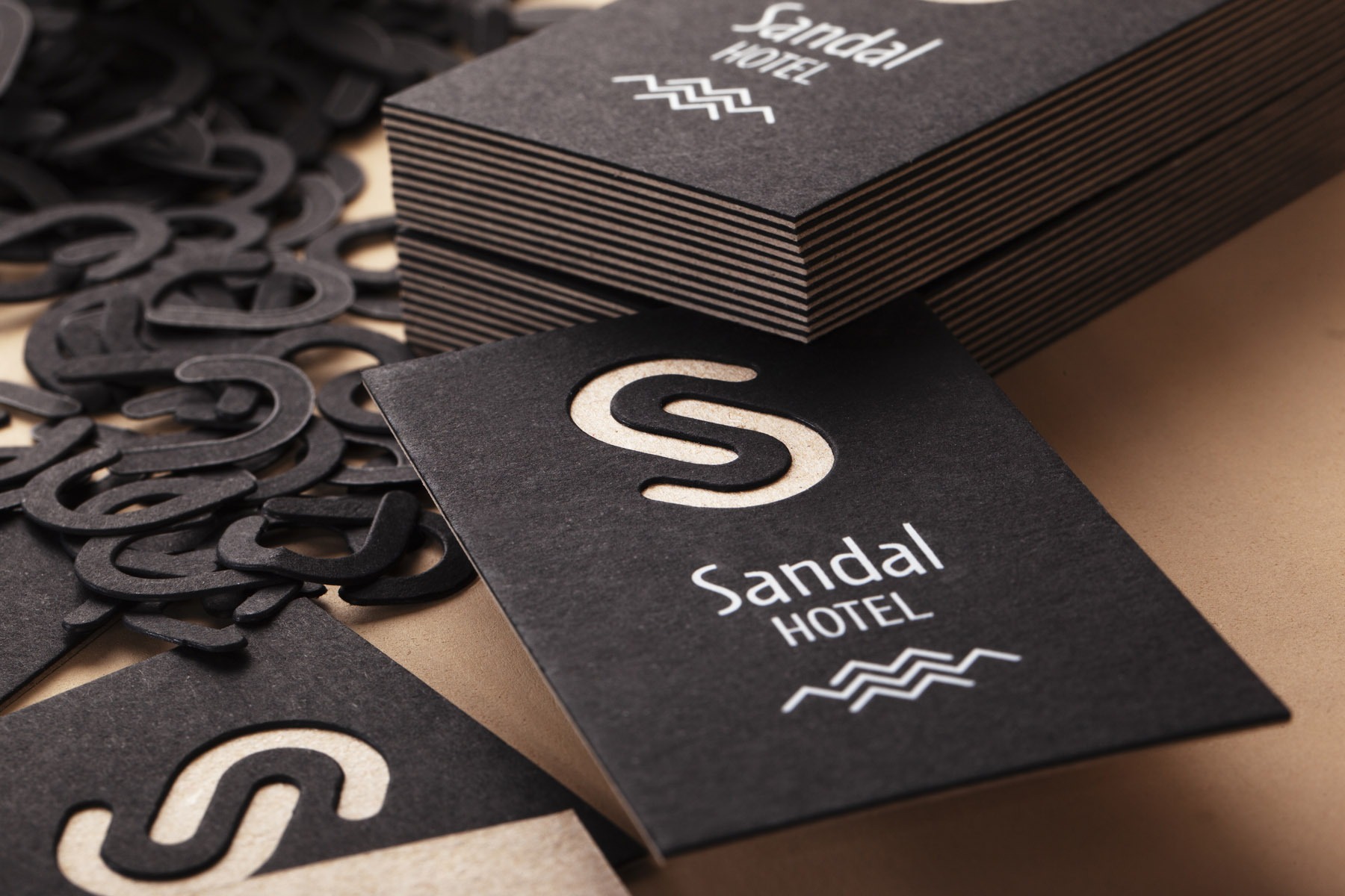
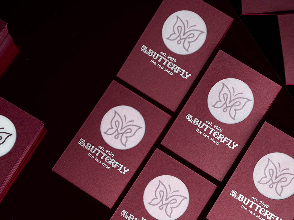
FROM MATERIAL TO CARD
Choose the paper, then build the process around it.
Tell us the paper family, colour, quantity, finished size and the effect the card needs to create. We can confirm availability and the appropriate production route before artwork approval.