
PAPER GUIDE
Fedrigoni Materica Paper: Fibre, Texture and Finishing
Materica is a pulp-coloured Fedrigoni paper with a rough, bulky surface shaped by a blend of CTMP, recycled, cotton and ECF fibres. Its natural texture and mineral-led palette give finished print a visibly material character.
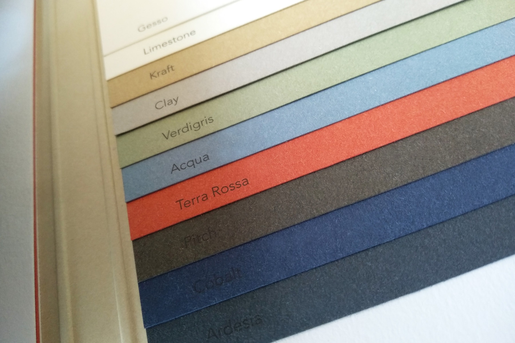
CURRENT RANGE
Fourteen named colour variations on Fedrigoni’s current page
WEIGHTS
120, 180, 250 and 360 gsm are listed across the range
FIBRES
CTMP, recycled, cotton and ECF fibres in the published composition
MATERIAL CHARACTER
Rough, bulky and deliberately fibrous.
Materica does not try to imitate a coated or perfectly flat printing surface. Cotton fibres contribute to the tactile roughness, while the broader fibre blend gives the sheet volume and a soft, natural visual structure.
The palette is organised around mineral, earth and oxidised tones. The colour sits through the sheet, allowing the edge to remain part of the material expression when cards, covers or tags are cut.
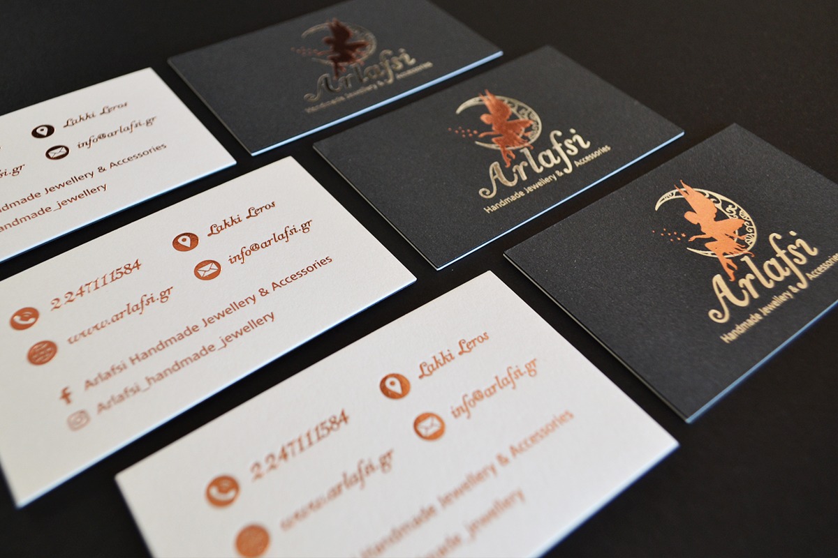
WHAT IT SUPPORTS
A strong paper voice beneath restrained finishing.
Materica is most convincing when the artwork respects the paper texture rather than trying to cover it completely.
01
Hot foil
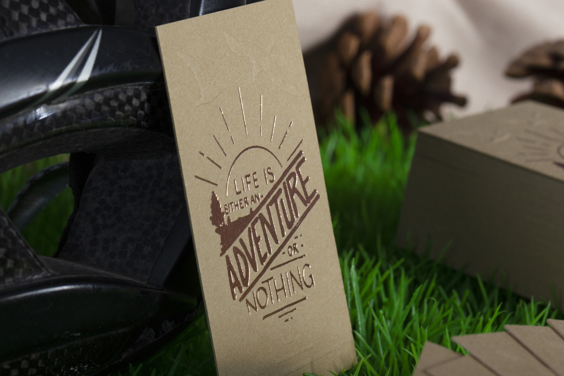
Foil introduces a smooth reflective plane over the rough sheet and can provide clear contrast on darker mineral shades.
02
Blind impression and embossing
The bulky surface responds to relief, but fine detail and reverse-side interference must be reviewed.
03
Spot-colour printing
Solid, well-spaced artwork is generally more predictable than delicate tonal work on the textured face.
04
Bonded structures
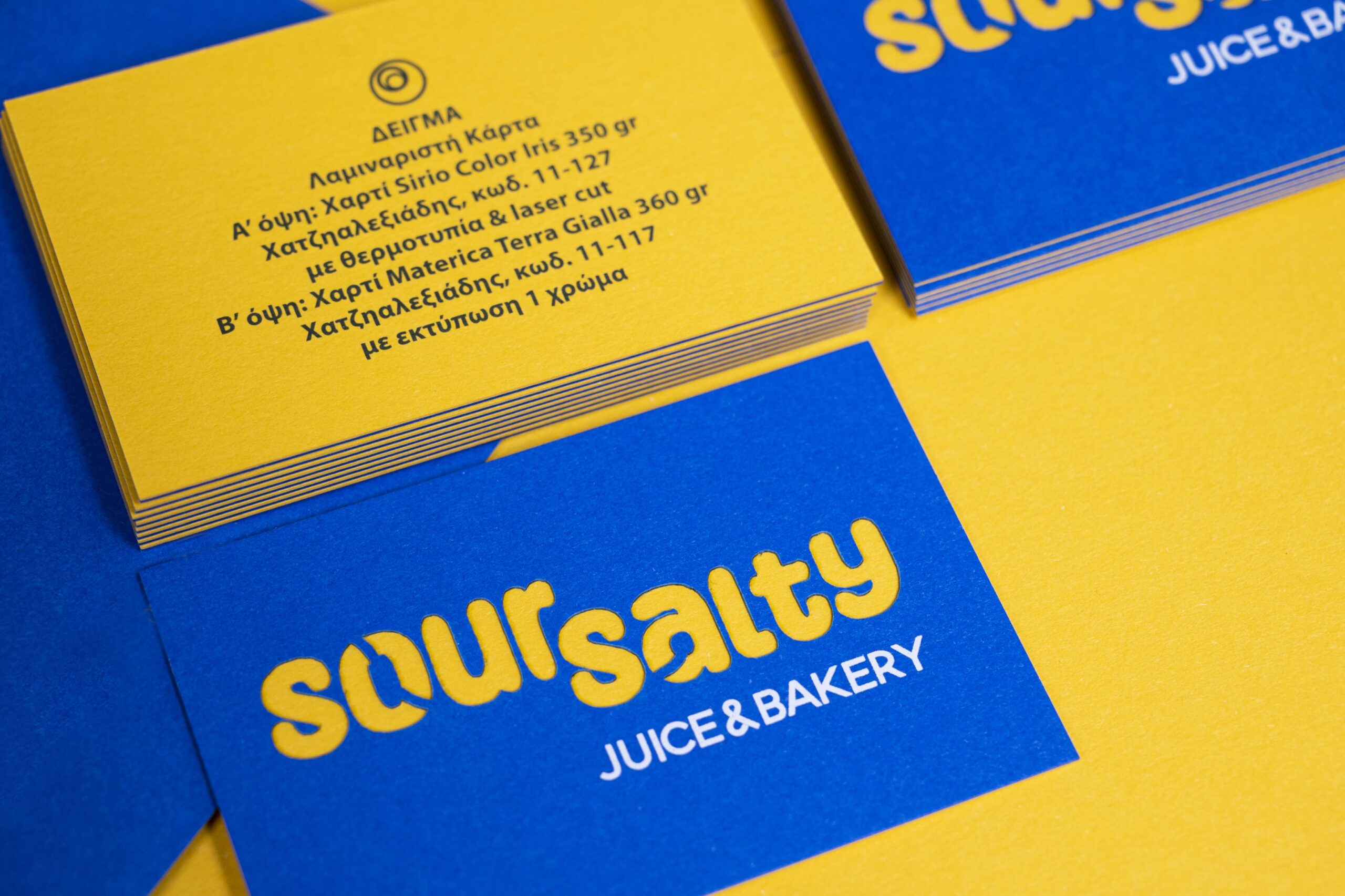
Two Materica colours can create a two-tone face-and-edge system, while a third sheet can add a reveal or internal layer.
CHOOSING MATERICA
Use it when surface character should remain visible.
Materica suits identities that benefit from an earthy, crafted or architectural material language. The paper remains visibly present even after printing and finishing.
Its texture is not neutral. Small type, thin rules and large smooth ink areas require appropriate testing, and a physical swatch is essential when colour is being matched to an existing brand system.
CONSIDER BEFORE CHOOSING
- Expect natural texture rather than a coated-flat face.
- Use physical samples to judge the mineral colours.
- Keep fine artwork generous enough for the surface.
- Confirm the chosen colour and weight before production.
ARTWORK APPROACH
Design with the fibre—not against it.
Use confident vector shapes for foil and impression, and keep small reversed elements away from heavily textured areas.
If more than one Materica colour is bonded, identify the face, reverse and any internal sheet explicitly so the intended edge sequence is unambiguous.
Range details checked against Fedrigoni’s current Materica range. Confirm current local stock before production.
FROM MATERIAL TO CARD
Choose the paper, then build the process around it.
Tell us the paper family, colour, quantity, finished size and the effect the card needs to create. We can confirm availability and the appropriate production route before artwork approval.