
GUIDE
Letterpress Printing
A raised printing plate carries ink directly onto paper under pressure. The result can combine crisp spot colour with an impression that is quiet, tactile or deliberately deep.

DIRECT PRINT
The raised image on the plate contacts the paper itself.
INK & PRESSURE
Colour and impression are controlled as related but separate qualities.
PAPER MATTERS
Thickness, softness and surface influence the depth and edge of the result.
HOW IT WORKS
Ink carried by a raised surface.
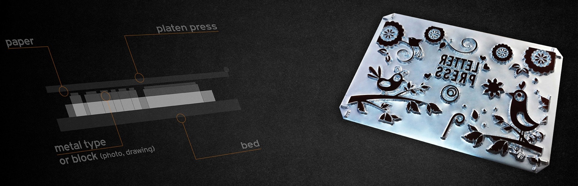
Letterpress is a relief-printing process. The printable parts of a plate stand above the non-printing areas. Rollers apply a controlled film of ink to that raised image, and the press brings it into direct contact with the paper.
A modern photopolymer plate can reproduce precise vector artwork while the press supplies the physical impression. Each ink colour is normally prepared and registered as its own printing operation.
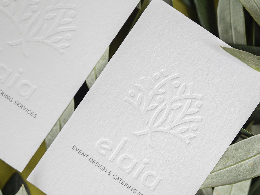
A blind impression uses pressure without ink. It may be produced on letterpress equipment, but it should not be confused automatically with every form of debossing: the tooling, depth and desired reverse-side effect still determine the correct production route.
WHAT IT CHANGES
Colour with a physical edge.
The appeal is not depth alone. Ink, paper and pressure have to work as one composition.
01
Crisp spot colour
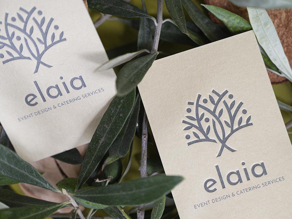
Letterpress is well suited to purposeful spot colours, line work and typography. Ink appearance still changes with the colour and absorbency of the paper.
02
A measured impression
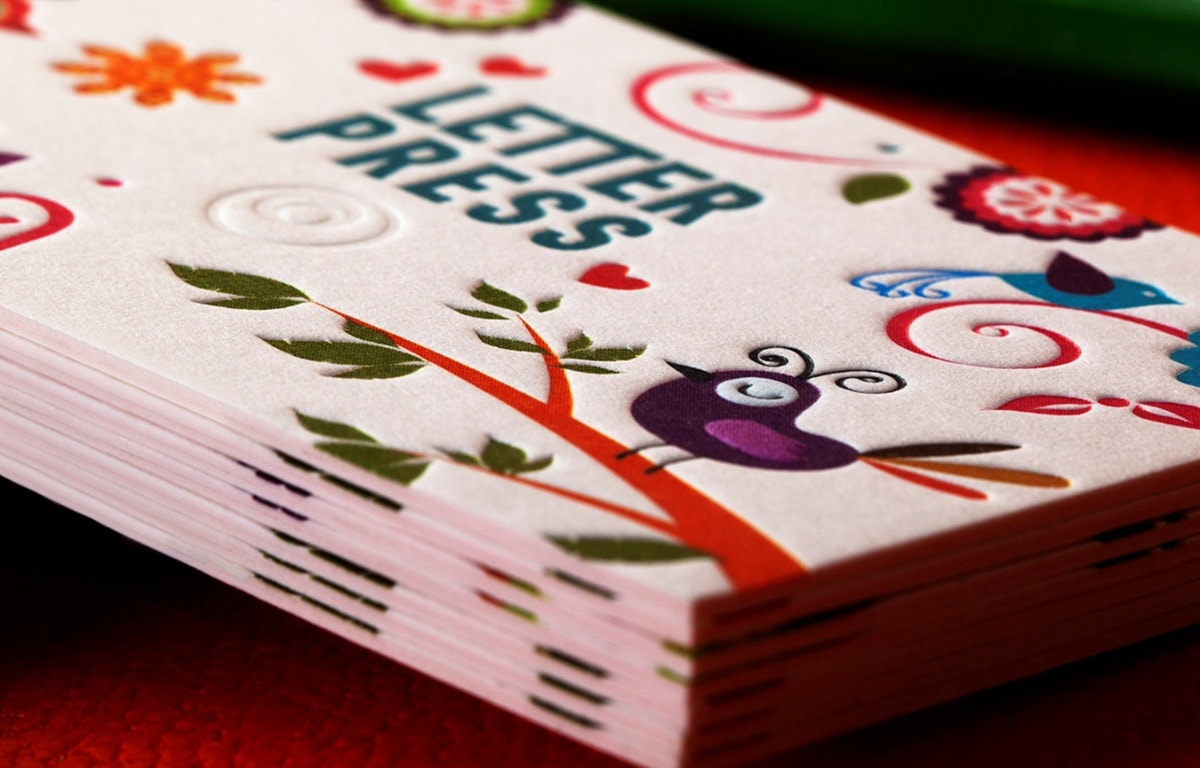
The surface can remain almost flat or carry a visible bite. The appropriate depth depends on the stock, image area and what must appear on the reverse.
03
Material-led detail
Uncoated and compressible papers often reveal the impression most clearly, while harder surfaces call for a different balance of ink and pressure.
WHEN TO USE IT
Best when restraint is part of the design.
Letterpress gives hierarchy to a wordmark, name, fine illustration or pattern without relying on a large field of printed colour. It is especially effective when the untouched paper remains visibly important.
A deep impression is not automatically the better result. Small type, large solids and delicate negative spaces ask for different plate and pressure decisions.
CONSIDER BEFORE CHOOSING
- Each ink colour and blind impression is planned as a separate operation.
- Heavy two-sided impressions can meet inside the sheet or show through on the reverse.
- Fine reversed type and large solid areas may need artwork adjustment or proofing.
- Paper choice affects ink density, impression depth and drying behaviour.
ARTWORK PREPARATION
Separate every colour and impression.
Supply clean vector artwork with each ink colour identified as a named spot colour. Place a blind impression on its own clearly labelled layer, separate from printed elements.
Outline type or include the fonts, keep paths clean and allow for trim and the safe area. Photographic shading, very fine screens and tiny reverses need prior review rather than being treated like ordinary offset artwork.
FINISHED WORK
Pressure can speak softly or boldly.
The most convincing work lets the impression support the identity rather than becoming a decoration added afterwards.

CHOOSE YOUR ROUTE
Move from understanding to choosing.
Use the collection or selector for established options. Expert Recommendation is for artwork that needs the paper, process or construction narrowed first.
ONLINE SHOP
Explore Letterpress Business Cards
Review the available papers and repeatable configurations before choosing the impression for your artwork.
EXPERT RECOMMENDATION
Balance depth, paper and two-sided artwork
Send the design and intended feel. We will identify the construction and impression approach that protect the detail on both sides.
THE LUXURY SAMPLE PACK
Letterpress needs to be touched.
Use the Sample Pack to compare paper softness, ink character and impression depth before specifying your own card.