
AI & SPECIALIST PRINTING
Using AI to Design Luxury Business Cards
AI can help develop luxury business-card concepts and, with suitable tools, create editable vector artwork. Hot foil, letterpress and blind impression each require files prepared for the selected paper and production process. Whether the artwork is created by a person or an AI agent, it needs checking before manufacture.
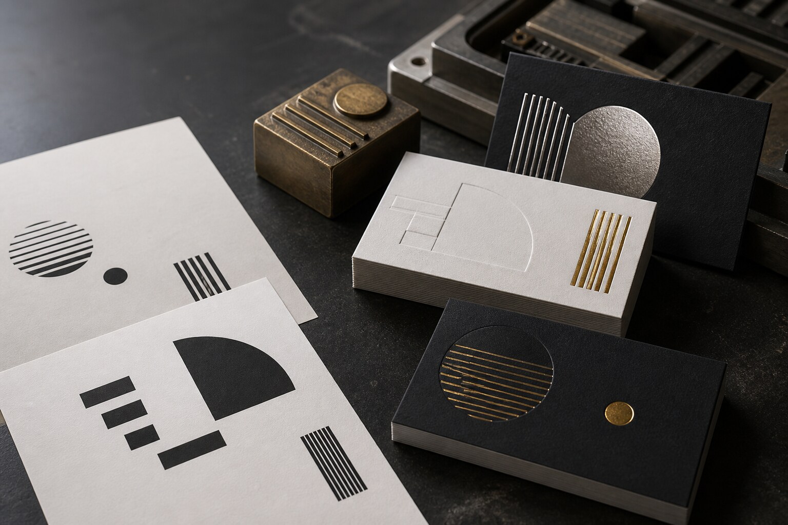
The reflective preview communicates the intention. The separate solid artwork tells the workshop what to produce.
AI IS STRONG AT
Ideas, visual direction and editable vector artwork with suitable tools.
PRODUCTION NEEDS
Exact vector shapes and checked artwork for each printing or finishing process.
THE HANDOFF
A designer or prepress professional verifies what the machines receive.
THE IMPORTANT DISTINCTION
A convincing luxury mockup is not production artwork.
AI can make a gold shape look reflective, add a shadow that resembles letterpress and place the whole idea on a thick black card. Those effects help people imagine the result, but the stamping die and printing plate cannot use photographic shine or simulated depth.
The workshop needs clean artwork for every physical process. Paper, foil, ink, impression and the two sides of the card must be planned together before production begins.
THE PRACTICAL RULE
AI can help create both the visual concept and the vector artwork. Check the files against the requirements of each production process.
WHY LUXURY IS DIFFERENT
Every visible effect represents a physical decision.
01
Hot foil needs a solid shape
The production layer defines where foil transfers. Reflections, metallic gradients and shadows belong in the presentation mockup—not in the die artwork.
02
Letterpress joins colour and pressure
Each ink colour is prepared separately. Line weight, negative space, paper softness and impression depth affect whether the printed result remains clean.
03
Blind impression is read through shadow
There is no ink contrast. The depth, direction of light, paper colour and shape of the artwork determine how clearly the impression can be seen.
FROM IMAGE TO INSTRUCTIONS
Separate the finished idea into production layers.
The number of layers depends on the actual specification. The principle remains the same: one clear artwork map for each separate printing or finishing process. Named layers help organise the design, but a layer name alone does not create a print separation. Supply the final files in the format and with the separations requested by the printer.
- 01Finished conceptHow the completed card should look and feel
- 02Paper specificationStock, colour, thickness, finished size and sides
- 03Foil artworkSolid vector shapes for each foil and side
- 04Letterpress artworkSeparate spot-colour shapes for each ink
- 05Blind artworkA separate layer for pressure without colour
COPY, COMPLETE, PROMPT
Ask for a concept and editable artwork.
Use this prompt as a starting point for experimentation. Explore how your chosen AI tool responds, adjust the instructions and compare the results. Outputs vary, and the prompt may not produce the design you have in mind.
Request editable vectors when the tool supports them, identify any specifications that still need confirmation and submit the resulting files for printer review.
LUXURY BUSINESS-CARD CONCEPT AND ARTWORK PROMPT
Create a front-and-back luxury business-card concept using this specification.

FINAL SIZE: {WIDTH × HEIGHT IN MM}
PAPER: {PAPER NAME, COLOUR AND THICKNESS}
SIDE 1: {HOT FOIL / LETTERPRESS / BLIND IMPRESSION / NONE}
SIDE 2: {HOT FOIL / LETTERPRESS / BLIND IMPRESSION / NONE}
FOIL COLOUR: {COLOUR OR REFERENCE}
LETTERPRESS INK: {COLOUR OR REFERENCE}
EDGE AND CORNER PROFILE: {SQUARE / ROUNDED / PAINTED EDGES}

Use the supplied logo and wording exactly. Do not redraw the logo or invent text.

First show a realistic presentation concept of the finished card.
Then show a separate plain process map for each requested production process.

In every process map, represent the elements as solid black shapes on white. Do not include metallic gradients, reflections, shadows, paper texture or simulated depth in the process maps.

If your tools support vector creation, also provide editable SVG artwork at the specified dimensions, with each side and process clearly identified. Use actual vector paths for production shapes, rather than embedding a raster mockup. Preserve the supplied logo and exact wording.

Keep each side and each process clearly separated. Identify any missing specifications or unresolved issues, and provide the files for printer review. Do not label unchecked files as production-ready. If vector export is unavailable, say so clearly and provide the concept and process maps for artwork preparation.
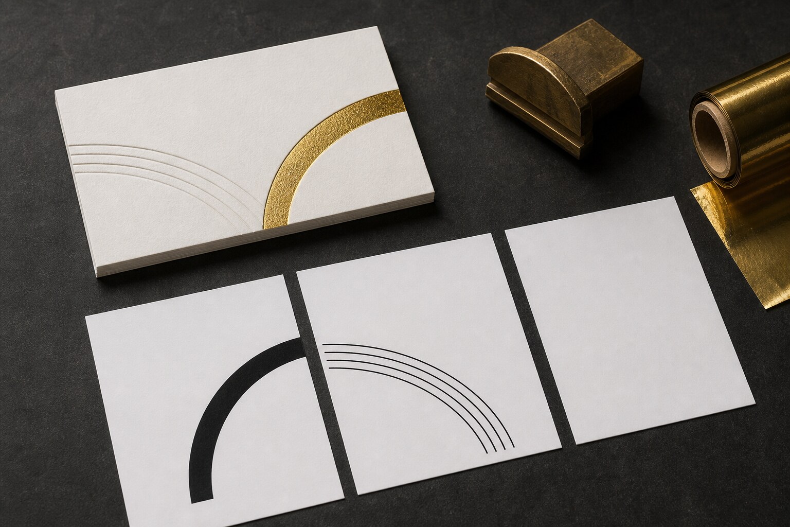
The mockup carries appearance. Each solid map carries one production instruction.
WHAT THE PROFESSIONAL ADDS
Precision, tolerances and responsibility.
A designer or prepress professional checks the supplied artwork and corrects or rebuilds only what is necessary. Suitable AI-generated vectors may already provide a usable starting point. Checks include dimensions, typography, line weight, negative space, colour separations and alignment between processes. Fonts must be outlined or supplied as agreed with the printer.
The printer checks the files against the selected paper, coverage, tooling, registration and impression. Artwork that meets these requirements does not need to be redrawn simply because it was created with AI.
Important: the production map is not supposed to look metallic or deeply impressed. It is supposed to be unambiguous.
HANDOFF CHECKLIST
What should accompany the approved concept.
- Exact finished dimensions and both card sides
- Chosen paper, colour and thickness
- Exact foil and letterpress colour references
- Original vector logo and verified wording
- Clearly identified artwork for every process and side
- Solid vector shapes without visual mockup effects
- Editable source file, outlined type or packaged fonts
- Printer review before the artwork is approved for production
COMMON QUESTIONS
From AI-generated artwork to production approval
Can AI create hot-foil artwork?
Yes. AI tools that generate vector graphics can create artwork for hot-foil stamping. The file must contain suitable vector shapes, with each foil and card side clearly separated. Before production, the printer checks fine details, gaps, coverage and registration against the chosen paper and tooling. A metallic-looking image alone is not die artwork.
How should the processes be separated?
Foil, inked letterpress and blind impression are separate physical operations. Identify each process and side clearly, then follow the printer’s requirements for separate files or spot-colour separations. Named design layers alone are not sufficient.
Is full colour less luxurious?
No. Luxury comes from a coherent design, material and execution—not from adding the greatest possible number of specialist processes.
START WITH THE RIGHT ROUTE
Bring us the idea—even when the files are not ready.
Send the concept, intended quantity and the finish you are trying to achieve. We can identify what is already usable and what still needs professional artwork preparation.